
Thursday, 15 December 2011
Evaluation Q7
Evaluation Q6
 Throughout creating my magazine many programmes and resources have been used to help me with my process. Programmes consist of photoshop, cameras, microsoft word and blogger, which helps me keep my work up to date. To start off with my magazine I used a Samson digital camera to take images which will feature in my magazine.
Evaluation Q3

Q magazine which is edited by Paul Rees, former editor of music magazine Kerrang! has similar features to my own magazine They layout is fairly similar with a medium shot taken of the cover model. Also the way the colour scheme is set out is similar, with the colour limited on the page so that my front cover looks professional. Also Q uses highted circles to make information more noticeable. Q's cover model image is also edited just like mine to make the cover look more modern and ideal for my audience. Q also shows their barcode, issue number and price which is the same as what I have done in my magazine. With similarities in both the magazines, this makes my magazine look more appealing to readers and will be more likely to buy it.

Evaluation Q1

I have selected 9 frames from my magazine. The first frame selected is the mass head on my front cover. The name Fusion is related to music as it means a mixture of different typed of music, which is formed to make popular everyday music which is ideal for my magazine. It's also a short, memorable name so it is recognised by the audience. The font is also in a funky type of Times New Roman, so that it looks more sophisticated but stylish at the same time and also ideal for young girls, who are my target audience. The colours you can see are my main colour scheme which are red, black and white.
 Similar to NME, which is a rock music magazine, I have highlighted main words within the headline in the colour red, to match with my colour scheme. I have chosen the word "shocking"to highlight to make my readers notice that something serious has happened and they need to find out by buying my magazine. Underneath I have used a quote "why we had to kick harry out" to reveal what it is all about but not unleash much information about it until they look inside.
 A frame taken from my double page spread is a group of photos from my cover model and the other band member which shows the reader what they look like. Also the borders to go around the images match with my colour scheme so that my magazine matches all the way through. I think that this layout is different from what other magazine have as other magazines would usually have one large image to take up one page unlike mine, where I have stacked them on top of each other.
  This frame I have taken from my front cover of my magazine. I have used arrows directing the reader to carry on to find out more about the story. Kerrang! and NME also use this to direct and locate the best part of the magazine. The rhetorical question "What ever happend to Holly Evans?" reminds the reader of the artist and interests them to know what has actually happened to her. The colours also match with my colour scheme from my magazine.
This frame was taken from my double page spread which is at the the end of the interview. This is just a bit more information to notify when the magazine will next hear of the band and to keepthe reader updated. I have also showed the bands latest album to show readers what it looks like and where you can buy them from if the are interested. Most music magazines such as Q or Kerrang! will have this after an interview for the same reasons.
 This frame is taken from the front cover of my magazine. It is the barcode, price and issue number of the magazine. All magazines will have these. This is just extra information so the readers knows how much my magazine costs and what issue number it is so they know whether they are up to date with the magazine.
This frame is also from my double page spread at the end of my interview which also gives extra information after the interview. This is also common for magazines to have at the end of an interview too. I have gave the readers information from when they can interact with the duo Wired by giving them the date, time and website to go on. I have highlight the web adress in red so that it stands out and is noticed by my readers straight away. The colour also go with my colour scheme throughout my magazine.
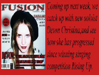
The last frame I have chosen is from my contents page. This is to show the readers what the next issue will be like so that it will attract and tempt my readers to make sure that they buy it. Kerrang! also do the same for the same reason and gives the reader a taster of what is coming up in the next issue. The colour used also go with my colour scheme.
Wednesday, 14 December 2011
Evaluation Q5


Another thing my readers will notice on my magazine is my highlighted circle on my magazine cover. The colours red and black contrast well together as they are very bold colours which will get notices straight away. Also what the text says "FREE TICKETS INSIDE" will also attract my readers as it is written in upper case letters and the word "FREE" instantly makes the reader interested as they won't have to pay. This will be ideal for my target audience as they are still at a young age and won't be able to afford to buy tickets for music festivals or concerts.

Overall, my magazine attracts my audience from the first look of the front ocver. The colour scheme is kept at just 3 colours, red, black and white throughout my magazine to make it look more proffesional and appealing to my audience.
Saturday, 10 December 2011
Evaluation Q4

My audience would buy magazine as the colour scheme contrasts well with the images used. Also my magazine has a mixture of bands and artists but mainly focuses on female artist such as Devon Christina and Holly Evans where they can relate to the audience more as they are young girls who are interested in their style of music.
Evaluation Q2


A B
The shot type for both photographs of my model is a medium shot at eye view. The differences are the posture and facial expressions. Model B's posture has their hands by their side and their body straight, whereas as model A has her sitting down cuddling in to herself which suggests that she has positioned to do this for a particular shot (magazine). Also, suggesting that she looks like a shy girl, but she is a confident, excited music artist. The differences on make up on both images are that I have focused more on image A concentrating on her and eyes and lips, with mascara and lipstick. These are the main areas that are targeted on the face where readers will notice immediately and admire. The main difference is my models costume. Image B costume is more casual, will printed t-shirt and their hair is tied up. Image A, the models hair has been straightened and styled and is wearing a thick coat with their hood up to make her look like she has her own sense of fashion where readers could look up to and admire her trend. Both images have been taken inside but the difference in lighting is that image B, the lighting in natural, whereas image A, the lighting has been purposely been put brighter to show and focus more on their face. Overall, the elements used in both photos represent a young female social group. There are variations of different people in my magazine but is more focused on normal people but with different styles, showing that it is good to be different and not the same.
New front cover
I have changed my magazine front cover in order to relate to my double page spread. As well as changing the cover model, I have changed the colour schem from purple, white and black, to red, white and black. This will go more with my new cover model.
Thursday, 8 December 2011
Inspirational double page spreads


In this music magazine Q, I like how you notice the large red 'L' in the background of the article. This is because the article is about successful music artist Lady Gaga and the 'L' stands for the first intitial of her stage name and is also in the colour red to match the magazines main colour scheme. This also looks effective as everything else in the article including the image is in black and white so the 'L' is extremely noticeable and stands out. In my double page spread, I would also like the colour scheme to match with the one on my front cover and contents page. This will make my magazine look more proffesional and sophisticated to readers.
New images for magazine

This image I have edited to make it brighter so that my model's lips and eyes stand out the most. Unlike the other photos, I have made he visible to my reader so they can recognise her straight away. I have also dressed her in a hat which shows she has her own sense of fashion.


These images will be used for my double page spread as well as some others with a different model as they will appear in a double act called 'Wired'
Sunday, 30 October 2011
Inspirational music magazine contents pages
 For my first inspirational contents page I have chosen from music magazine Kerrang! I like how to colour scheme is kept throughout the contents page with the use of yellow, black and white. These colours work well with each other as the black contrasts well with the yellow and white borders and background. Also the colours chosen for the colours scheme are suitable for both genders. I like how Kerrang! have an organised and structured layout throughout the contents by sectioning their stories under subheadings (Live Review, Features, Gigs...) This makes it easier for the reader to find what they are looking for or what they are interested in.. I also like how they have placed images around the page with the page number next to them as readers may recognise the models in them and would want to read about them. Overall I like Kerrangs This is something I would like to do when designing my contents page.
 For my second inspirational contents page, I have chosen from music magazine Q. The colour scheme for this magazine is red, black and white, which contrast well with one another as they are block colours which stand out amongst one another and can be suitable for both genders, hich also meets with their audience of being male and female. I like how the logo of the magazine has been placed in the top left hand corner with it in a red background and contrasts with the white text, which makes the logo easily recognised by readers wherever it is. I like how the image used in the text has been purposely enlarged so that the reader notices it straight away which indicates that there is an interesting story inside and could of also been the headline on the front cover of this magazine. With the picture of the band 'The Couteeners' being quite large it suggests that they are a popular band and most readers would want to know what the article is about. The date and issue number have been placed on the top right hand corner. I like how they have done this as it makes it easier for the reader to see that they are updated with the latest features and news in the magazine. It is something I would also like to use when creating my magazine.
For my third inspiration contents page I have chosen from music magazine NME. The colour scheme has been kept throughout the magazine with the use of colours red, white and black which again contrast well with each other as they are block colours and stand out from one another. The magazine has also sectioned what is in the magazine in groups so that it is clearer and easier for the reader to find what they are looking for and interested in (News, Radar, Reviews...). I like how the layout of the magazine is structured so that everything is spaced out and easy for the reader to find which something I would like to do in my contents page so that my magazine can be more appealing to my audience. In the bottom left hand corner, NME have highlighted information in an arrow shape pointing inside the magazine which tells the reader to read on and find out what it is all about which indicates that it will be interesting and a must read for the audience. This would be something that I woukd like to do for my contents page as it catches the audiences eye immediately, especially when it is in a bright block colour.
Friday, 7 October 2011
Questionare for magazine
How much money would you pay for a magazine?
What is your favourite genre of music?
Rock? Pop? Indie? RnB? Other?(please name)
What is your favourite part of a magazine?
What sort of features do you dislike of a magazine?
Do you read magazine often?
What features of a magazine do you enjoy reading?
Do you play any instruments?
How many gigs/festivals do you attend each year?
Which way do you prefer to listen to music?
Thursday, 6 October 2011
Homework magazine covers (HEAT)
This is an audience study where I will answer specific questions on Heats's audiences judging by the way the magazine cover looks and what is inside.

What mode of transport would the audience use?
This reader would use a car for their transport as the audience is aimed at young female adults that care a lot about their appearance and would like a nice car to match with their interests.
What type of accommodation would the audience live in?
The type accommodation that this reader would live in would be either a stylish apartment with nice furniture or even a house.
What would the audience be most likely to drink?
Beverages that this reader would drink would be things such as healthy smoothies are diluted juice, and water.
What TV shows would the audience most likely watch?
TV shows this reader would watch would be feminine and glamorous type of shows such as 90210, gossip girl and desperate housewives.
They would listen to chart music and anything that is popular.
Favourite sports would be something like yoga or going to the gym to stay in shape
What relationship status would the audience most likely have?
The readers would either be in a strong relationship or if single looking for one
This magazine doesn't really show signs of politics or government; they would be more interested in fashion and celebrities.

What would the audience have for breakfast?
The sort of breakfast cereal that this reader would eat would be healthy things such as Weetabix. Alpean and Special K
What mode of transport would the audience use?
This reader would use a car for their transport as the audience is aimed at young female adults that care a lot about their appearance and would like a nice car to match with their interests.
What type of accommodation would the audience live in?
The type accommodation that this reader would live in would be either a stylish apartment with nice furniture or even a house.
What would the audience be most likely to drink?
Beverages that this reader would drink would be things such as healthy smoothies are diluted juice, and water.
What TV shows would the audience most likely watch?
TV shows this reader would watch would be feminine and glamorous type of shows such as 90210, gossip girl and desperate housewives.
What TV channel will the audience most likely watch?
They would also have an interest in cooking programmes as they would like to see all healthy meals.
What type of music will the audience listen to?They would listen to chart music and anything that is popular.
What will the audience’s favourite meal be?
Favourite foods would be things such as a salad or pasta, anything healthy is ideal
What type of sport will the audience be interested in?Favourite sports would be something like yoga or going to the gym to stay in shape
What relationship status would the audience most likely have?
The readers would either be in a strong relationship or if single looking for one
Where would the audience mostly likely go to on holiday?
The type of holidays this reader would go to are places which are sunny and warm so that they are able to get a tan
Would this type of audience be interested in voting?This magazine doesn't really show signs of politics or government; they would be more interested in fashion and celebrities.
What type of bars or clubs would the audience go to?
This reader would go to popular, glamorous night clubs
Wednesday, 5 October 2011
Homework magazine covers ( KERRANG!)
This is an audience study where I will answer specific questions on Kerrang's audiences judging by the way the magazine cover looks and what is inside.

What mode of transport would the audience use?The mode of transport that Kerrang! readers would use would be public transport such as trains and buses, this is because Kerrang! magazine is aimed for a young adult audience so they wouldn't have enough money
to afford cars that older adults have these days, although some may own a car but it wouldn't be a very good model as they wouldn't have the money to buy an expensive one.
What type of accommodation would the audience live in?The type of accommodation that Kerrang! readers would live in would be either university halls, a shared flat or even still living with their parents.
What would the audience be most likely to drink?Kerrang! readers would be likely drink alcohol, energy drink and fizzy drinks, basically anything that has sugar in and are unhealthy.
What TV shows would the audience most likely watch?The TV shows that Kerrang! readers are most likely to watch are music based shows or music channels.
What TV channel will the audience most likely watch?Kerrang! have their own channel which shows music play lists, live concerts and interviews with the bands and artist.
What type of music will the audience listen to?The type of music that Kerrang! readers would listen to would be rock music, particularly bands.
What will the audiences favourite meal be? Kerrang! readers favourite meal would be easy cooked meals, such as microwave meals, but they would most likely be takeaway food such as pizza, chinese and kebabs.
What type of sport will the audience be interested in?I wouldn't think that kerrang! readers will be interested in sport, they would much rather go to a music concert than a gaming event.
What relationship status would the audience most likely have?Kerrang! readers would either be single, and having one night stands or in a relationships with the someone with the same interest in music as them.
Where would the audience mostly likely go to on holiday?Holidays that Kerrang! readers are most likely to go to would be places such as amsterdam or places in the country where musical festivals are to happen such as leeds and Glastunbury.
Would this type of audience be interested in voting?This magazine shows no signs or indication that the readers would vote, they wouldn't be interested in politics are the government.
What type of bars or clubs would the audience go to?Kerrang! readers would attend pubs and bars that have live bands playing.
What would the audience have for breakfast?
The sort of breakfast that Kerrang! readers would have would be things that are easy to make such as flavoured sugary cereal (coco pops, sugar puffs) They would also be considered to eat food that was made the other night such as take away pizzas.What mode of transport would the audience use?
to afford cars that older adults have these days, although some may own a car but it wouldn't be a very good model as they wouldn't have the money to buy an expensive one.
What type of accommodation would the audience live in?
What would the audience be most likely to drink?
What TV shows would the audience most likely watch?
What TV channel will the audience most likely watch?
What type of music will the audience listen to?
What will the audiences favourite meal be?
What type of sport will the audience be interested in?
What relationship status would the audience most likely have?
Where would the audience mostly likely go to on holiday?
Would this type of audience be interested in voting?
What type of bars or clubs would the audience go to?
NME magazine cover.
 I have chosen the NME magazine to analyse.
NME's audience would be aimed at both genders aged 15-30. We know this because this age range is fairly young and people this age tend to have a strong interest in modern day music. We can also see this by the colours which the magazine uses which are orange, grey and white, so that it isn't too masculine or too feminine.
The text is selling updated news of the music industry show the readers what in and what not, it also shares musical knowledge to the readers and keep them up to date with the latest bands and artists.
This magazine gives off a rock lifestyle image which indicates that music is a very important thing in the readers life.
Friday, 30 September 2011
3 original photos
For this image I have decided to edit the colour into black and white. I've done this because i think it will make my magazine more stylish and appealing to my audience. I have positioned my model so that he is facing side ways and his hair is blocking his eyes giving him a mysterious look. This could suggest that he is a new music artist or he is returning from a break.


This image I have chosen is just of a micro korg which i will put in as a feature in my music magazine for maybe a prize from a competition, which will attract my audience to buy my music magazine as this is what thye will be interested in.
Monday, 26 September 2011
For my coursework in AS media studies I will be using this blog to update all my work and show my progress throughout the assignment. The assignment I have chosen for my coursework is a music magazine. I would like my music magazine to have similar features to Kerrang! magazine, as I like the layout the images and colours used to make the magazine look more representative to their target audience. I will be using orginal images for my front cover and contents page but have different models and take various shots so that my magazine doesn't look boring and repetative.
Subscribe to:
Comments (Atom)