
Thursday, 15 December 2011
Evaluation Q7
Evaluation Q6
 Throughout creating my magazine many programmes and resources have been used to help me with my process. Programmes consist of photoshop, cameras, microsoft word and blogger, which helps me keep my work up to date. To start off with my magazine I used a Samson digital camera to take images which will feature in my magazine.
Evaluation Q3

Q magazine which is edited by Paul Rees, former editor of music magazine Kerrang! has similar features to my own magazine They layout is fairly similar with a medium shot taken of the cover model. Also the way the colour scheme is set out is similar, with the colour limited on the page so that my front cover looks professional. Also Q uses highted circles to make information more noticeable. Q's cover model image is also edited just like mine to make the cover look more modern and ideal for my audience. Q also shows their barcode, issue number and price which is the same as what I have done in my magazine. With similarities in both the magazines, this makes my magazine look more appealing to readers and will be more likely to buy it.

Evaluation Q1

I have selected 9 frames from my magazine. The first frame selected is the mass head on my front cover. The name Fusion is related to music as it means a mixture of different typed of music, which is formed to make popular everyday music which is ideal for my magazine. It's also a short, memorable name so it is recognised by the audience. The font is also in a funky type of Times New Roman, so that it looks more sophisticated but stylish at the same time and also ideal for young girls, who are my target audience. The colours you can see are my main colour scheme which are red, black and white.
 Similar to NME, which is a rock music magazine, I have highlighted main words within the headline in the colour red, to match with my colour scheme. I have chosen the word "shocking"to highlight to make my readers notice that something serious has happened and they need to find out by buying my magazine. Underneath I have used a quote "why we had to kick harry out" to reveal what it is all about but not unleash much information about it until they look inside.
 A frame taken from my double page spread is a group of photos from my cover model and the other band member which shows the reader what they look like. Also the borders to go around the images match with my colour scheme so that my magazine matches all the way through. I think that this layout is different from what other magazine have as other magazines would usually have one large image to take up one page unlike mine, where I have stacked them on top of each other.
  This frame I have taken from my front cover of my magazine. I have used arrows directing the reader to carry on to find out more about the story. Kerrang! and NME also use this to direct and locate the best part of the magazine. The rhetorical question "What ever happend to Holly Evans?" reminds the reader of the artist and interests them to know what has actually happened to her. The colours also match with my colour scheme from my magazine.
This frame was taken from my double page spread which is at the the end of the interview. This is just a bit more information to notify when the magazine will next hear of the band and to keepthe reader updated. I have also showed the bands latest album to show readers what it looks like and where you can buy them from if the are interested. Most music magazines such as Q or Kerrang! will have this after an interview for the same reasons.
 This frame is taken from the front cover of my magazine. It is the barcode, price and issue number of the magazine. All magazines will have these. This is just extra information so the readers knows how much my magazine costs and what issue number it is so they know whether they are up to date with the magazine.
This frame is also from my double page spread at the end of my interview which also gives extra information after the interview. This is also common for magazines to have at the end of an interview too. I have gave the readers information from when they can interact with the duo Wired by giving them the date, time and website to go on. I have highlight the web adress in red so that it stands out and is noticed by my readers straight away. The colour also go with my colour scheme throughout my magazine.
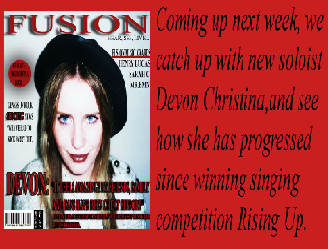
The last frame I have chosen is from my contents page. This is to show the readers what the next issue will be like so that it will attract and tempt my readers to make sure that they buy it. Kerrang! also do the same for the same reason and gives the reader a taster of what is coming up in the next issue. The colour used also go with my colour scheme.
Wednesday, 14 December 2011
Evaluation Q5


Another thing my readers will notice on my magazine is my highlighted circle on my magazine cover. The colours red and black contrast well together as they are very bold colours which will get notices straight away. Also what the text says "FREE TICKETS INSIDE" will also attract my readers as it is written in upper case letters and the word "FREE" instantly makes the reader interested as they won't have to pay. This will be ideal for my target audience as they are still at a young age and won't be able to afford to buy tickets for music festivals or concerts.

Overall, my magazine attracts my audience from the first look of the front ocver. The colour scheme is kept at just 3 colours, red, black and white throughout my magazine to make it look more proffesional and appealing to my audience.
Saturday, 10 December 2011
Evaluation Q4

My audience would buy magazine as the colour scheme contrasts well with the images used. Also my magazine has a mixture of bands and artists but mainly focuses on female artist such as Devon Christina and Holly Evans where they can relate to the audience more as they are young girls who are interested in their style of music.
Evaluation Q2


A B
The shot type for both photographs of my model is a medium shot at eye view. The differences are the posture and facial expressions. Model B's posture has their hands by their side and their body straight, whereas as model A has her sitting down cuddling in to herself which suggests that she has positioned to do this for a particular shot (magazine). Also, suggesting that she looks like a shy girl, but she is a confident, excited music artist. The differences on make up on both images are that I have focused more on image A concentrating on her and eyes and lips, with mascara and lipstick. These are the main areas that are targeted on the face where readers will notice immediately and admire. The main difference is my models costume. Image B costume is more casual, will printed t-shirt and their hair is tied up. Image A, the models hair has been straightened and styled and is wearing a thick coat with their hood up to make her look like she has her own sense of fashion where readers could look up to and admire her trend. Both images have been taken inside but the difference in lighting is that image B, the lighting in natural, whereas image A, the lighting has been purposely been put brighter to show and focus more on their face. Overall, the elements used in both photos represent a young female social group. There are variations of different people in my magazine but is more focused on normal people but with different styles, showing that it is good to be different and not the same.
New front cover
I have changed my magazine front cover in order to relate to my double page spread. As well as changing the cover model, I have changed the colour schem from purple, white and black, to red, white and black. This will go more with my new cover model.
Thursday, 8 December 2011
Inspirational double page spreads


In this music magazine Q, I like how you notice the large red 'L' in the background of the article. This is because the article is about successful music artist Lady Gaga and the 'L' stands for the first intitial of her stage name and is also in the colour red to match the magazines main colour scheme. This also looks effective as everything else in the article including the image is in black and white so the 'L' is extremely noticeable and stands out. In my double page spread, I would also like the colour scheme to match with the one on my front cover and contents page. This will make my magazine look more proffesional and sophisticated to readers.
New images for magazine

This image I have edited to make it brighter so that my model's lips and eyes stand out the most. Unlike the other photos, I have made he visible to my reader so they can recognise her straight away. I have also dressed her in a hat which shows she has her own sense of fashion.


These images will be used for my double page spread as well as some others with a different model as they will appear in a double act called 'Wired'
Subscribe to:
Comments (Atom)