
Monday 30 April 2012
Mood Board
Sunday 29 April 2012

Flat plan of DPS + Rationale

Images - Images I am using in my DPS is one big image and four small images on one side of the page. They will consist of both a boy and girl (friend and brother) as my main story is an interview of a double act. I am going to try and make my images look as natural as i can but may need to edit the lighting in some of them so that my readers can see the picture clearly. My images will be taken behind a clear white wall so that there are no other distractions from the main image and that they don't look too busy. I will also include props in my images, such as microphones and microkorgs. This can indicate what both of my models do (girl is the main singer and the boy plays accompanies her with the music).
Layout and Text- For the layout of my DPS I have decided to split the pages so that the left side is just images of the duo and the right is the actual article, which is an interview. I have chosen this layout as it will appeal more to my target audience as they wouldn't want to read much and would only like to know the stuff that may interest them in the interview. They may also like to keep the imaged page as a poster. For the title, I am going to use 'FUSIONS INTERVIEW CORNER... WIRED' in a large, block text so that it stands out on the page. It also shows that my magazine always has interviews in every issue which may interest the reader as they may like reading interviews, therefore will make them carry on buying my magazine every week. In my actual interview I will make sure not to put much text on as it may bore the reader, so I will make sure that my questions are short and simple so that my audience don't lose interest and can read it easily
Overall I am happy with the layout of my DPS and think that there is a good balance of both text and images so that my reader will keep interest when reading and not get bored.
Flat plan of contents page + rationale

Colour scheme - With having changes with the colours due to the changes with my front cover, I have decided to go with the colour scheme red, black and white throughout the magazine as I think the colours will contrast well together and will be suitable for both genders. I have made sure that the colours are equally balanced out so they are not over powering one another. I have split the background colour into two using black and red. Most of my text on the right hand side will be in white so it stands out from the black background and on the left, my text will be black so it stands out from the red background.
Images - I have decided to put more images inside the contents page as I only had one large image on my front cover. The images will be used to show my reader images of the people who will be featuring in this magazine issue. I have took three original images of my friends Anya, Hannah, and Ayeisha, to pose as rock artists by dressing them up and make them look like typical rock girls. This is so I can use in my magazine and say that they are posters that readers can keep. This acts as a freebie which will get my audience more tempted to buy the magazine as they may be a fan of the people who are on the posters and would like to keep the image so they could use to hang up on the bedroom wall. One of the main images you will see is a picture of one of my friends Claire, on the bottom right of my contents page. I have took an image of her using the guitar as a prop, so she looks more musical. I will edit the contrast of the image so that the reader can see her bright red hair more (which matches with the colour scheme) I have also used arrow shapes within the contents page to point out several stories featured in my magazine. This will be to alert my audience that this is a 'must read' story and think they will be most interested in amongst the other stories.
Layout and Text - Like I said before, I have split the back ground colour in two so that one side can have the actual page contents where I have put numbers on and the story next to them and on the other side I have put extras which include images of prizes that can be won in the magazine and posters. I may add a guest contributor so there isn't a lot of spare space which may make my contents page looks bare and boring. On the bottom right hand corner, there will be an 'Every Week' contents, where it will show what is in every issue of the magazine, which may make the audience want buy my magazine as they may enjoy reading the features that appear in every issue of my magazine. The text I will use will be very big and very bold so that my readers can read it easily. Most of my text will be short, simple sentences so that my audience can read it and not get bored of it as they would be reading longer sentences in the stories that feature in my magazine. I will also have a mast heading on the top of the page in a large, bold font so that it is recognisable to my audience. it will also include the date of this issues so that my audience can keep track and check that they have the right addition.
Overall I think that my contents page will meet the needs of my audience as they will be able to locate the pages easily and will be able to recognise music artist that they like due from the images I have used.
Front cover flat plan + rationale

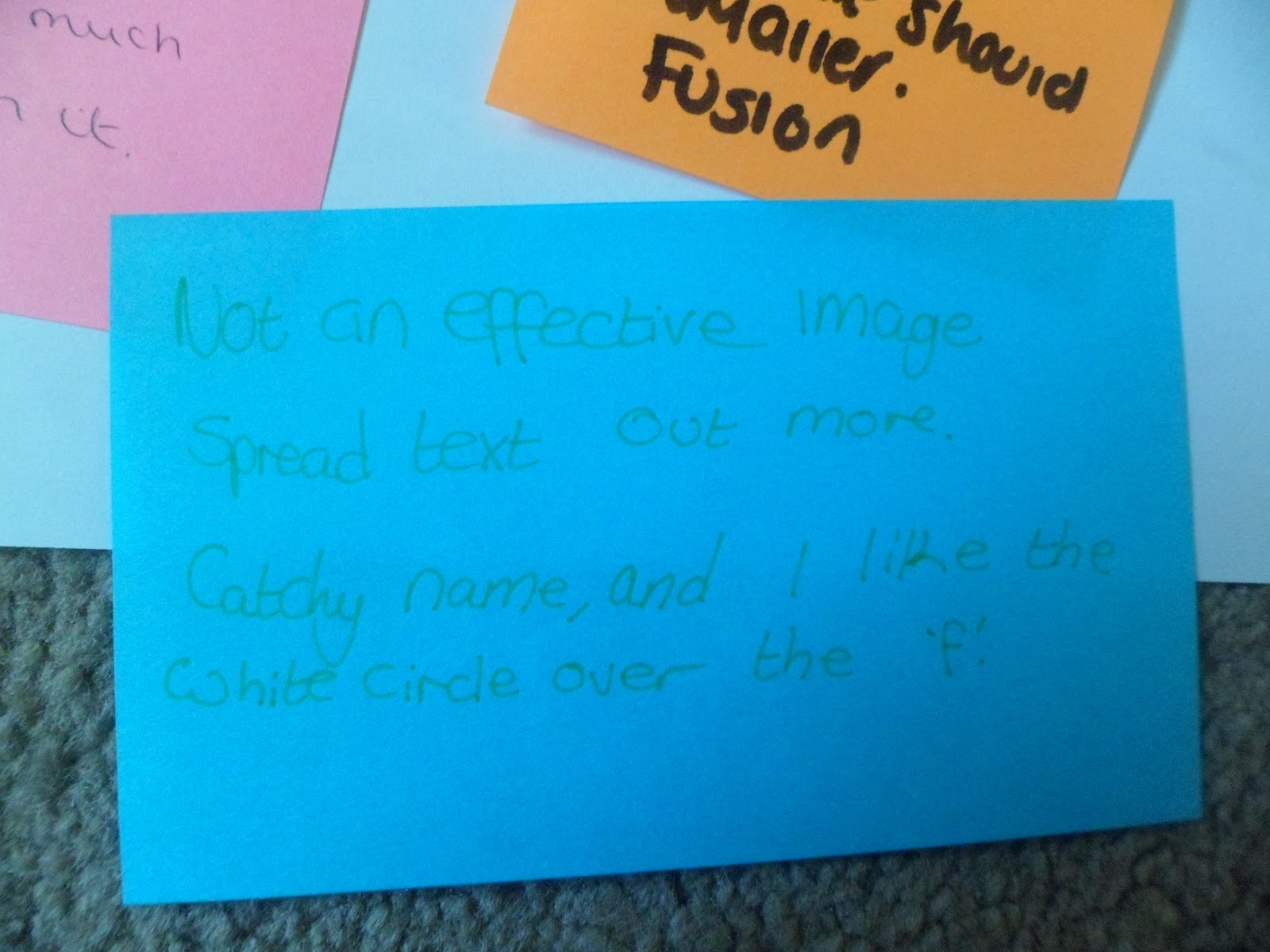
Mast heading - This is a flat plan for my music magazine, which I have named Fusion. I have chosen to name my magazine that as it is music related as it means a mixture of different types of music used to make popular everyday music. It also one word so with two syllables it is easily remembered and will be spread clearly on the top of my page. I have been influenced by this idea from music magazine KERRANG!
Colour scheme - The colour scheme I have chosen for my magazine is black, white and purple as I think that those colours are suitable for both male and female, who are my target audience. The colours are also very bold and will stand out from one another one the page making my magazine more eye catching to my audience. the black and white will be mainly used to outline headline, titles and images to make them stand out more on the page.
Image - My front cover will contain only one image on the page which is a medium shot of my cover model, it will also be the background of my front cover so that the image is noticed by my audience. The image will be edited into black and white so it goes with the colour scheme and sets a dark rock-like atmosphere so it appeals to my audience, but I also want to edit the cover models hair using photo shop by putting in some coloured streaks (purple) in his hair so he looks more like a rock artist and it will also match the colour scheme.
Layout - I have set the layout of my front cover so that the main headline is in the centre of my magazine, and other stories and features inside my magazine or placed on either side of the cover model. I think this layout makes my magazine look more organised and the readers can manage to read it easily. I will make sure that each story on my front cover with have a sub heading and will be made slightly bigger so that it catches my audiences eye. I will also have a highlight shape which I've made into a circle, where I will put something that may interest the reader and will hopefully convince to buy my magazine.
Overall, I think this design will work very well and I am happy with the images, colours and layout throughout the page.
Saturday 28 April 2012
Front cover design changes
 As you can see, I have changed the front cover of my magazine several times before I finally came to the final design. For my first design, I went with the colour scheme of black, white and purple as I think it would be suitable for both genders who are my target audience. When recieving feedback from my lecturer and others I found that others wern't too sure sure about the cover model and the amount of text I had on the cover. Even though I liked my design I decided to change everything in order to get a more positive outcome. This include changing the colour scheme, cover model, the font and most of the text.
 Here is a picture of my new design of my magazine cover, I have changed the colour scheme, replacing the purple, with red. I felt like the colour was more stronger and stood out more on the page. I also felt that the cover model was better as many of the feedback said that it would be better if the model was facing the camera, instead facing away from it. I also like the the change of font as my magazine looked more proffesional and I compared similarities with music magazine Q. Althoug I like the change of font and cover model, I felt as though my magazine was aiming more at a female audience instead of both genders. Also my lecturer felt that my old magazine design was stronger and preffered it to my new design, therefore I changed this design back to my old one but made slight changes so that the stories in my contents page and double page spread would link to my front cover.
 This is my final design of my magazine front cover. I have kept the previous colour scheme as I still thought it was stronger and is suitable for both genders. I like how the cover model and background colour is in black and white as it lets the colour of my text stand out more on the page, unlike my other design where it was difficult to make out some of the text. I have also changed back to my old font as I think it achieves the genre of my magazine, which is a rock magazine, unlike my previous design, where it never looked like a rock magazine at all. Overall, I prefer this design and i am happy that I have changed back to this design as I feel it matches my audience and genre :)
Inspirational front covers
 This is a cover of female celebrity gossip and fashion magazine, More! which is a magazine I enjoy reading. I like the magazine for their stories, features and overall layout. I like how the colour scheme for every isuue the magazine brings out, the colour scheme is different, mainly matching the cover model. The colour scheme for this uses attractive and feminime colours to match the magazines audience, which are young females aged 16-30. Although there are other colours used such as yellow, the colours still work well with one another as they highlight key information on the magazines cover so that the audience can notice it and be more drawn to reading it. This is something I would like to achieve in my magazine's front cover by try to make key information more noticeable to grab my audiences attention. Other things I like about this magazine is that the layout has been structured so that every story has it's own individuality so the magazine itself doesn't come across as boring and repetetive throughout. I also like how the highlighted circle on the left which says "More! fashion for less money", this shows that the magazine has used their title More! to commercial itself in the stories and features they have. It also shows the audience that the latest fashion is afforable and shows images of clothes, shoes and accessories so that the audience can relate to it as they may like what they see and be brought to buying the magazine.
The cover model used in the magazine appears to be a photograph taken by papparazi of Cheryl Cole, where she looks happy as she is smiling. The headline used is "CELEB EXCLUSIVES" which gives off that the magazine has important and interesting news about Cheryl, which we would want to know.

This is the front cover of one of the biggest music magazines in the UK, Q. I don't really read this magazine but I find the style of it unique and attractive. The main colour scheme we see is the block colours which are red, white and black, which contrast well with one another and can be ideal for the audience which is aimed at both male and female aged 16-25.
There is also I soft, light grey background which I think goes extremly well with the main colour scheme and gives it elegence and makes the magazine look tidy and proffesional which will appeal to the audience. This is something I would like to percieve into creating my magazine as my audience will be for both genders as well.
The cover model used on the front cover is of popular music artist, Lady Gaga, who is known for her unique style and having an extremely successful music career. We see her uniqueness by the way the photo used has been taken. It shows that this photo has been taken proffesionally, which is common on most front covers of Q magazine, as she has been told to pose in a certain way in a full length shot, which shows off what she is wearing. Although the image may seem 'revealing', with Lady Gaga being extremly well known to the public, they would understand that this is what she would usually do/wear/act and be familiar to her style. Also parts of her name is big capital letters have been hidden by the photograph of her, but it doesn't really affect the way the audience will see it, as they will more than likely know who it is without her name being there as she is a global popstar and is recognised by people all over the world.
I also like how a range of fonts have been used for each sub heading on the right hand side of the front cover, "JIMI HENDRIX" and "VAMPIRE WEEKEND" have boths been printed in a big, bold font which could represent that they are big, mighty artists and are well known to the audience. This is also another technique that I would like to use when creating magazine so that my audience can recognise and notice music artist that are appearing in my magazine.
This magazine cover is from rock music magazine KERRANG! I see this magazine as very chaotic from the cracked effect which is used in the font thtoughout the front cover. This relates more to the audience as they are interested in rock music, which is loud, destructive and lively. KERRANG! usually change their colour scheme in every issue but the colours always achieve to make their magazine live up to it's rock-like theme. One of the main reasons I like this front cover is that band Blink 182 is the main headline, and i enjoy listening to their music. Although it might be slightly biased, it would also attract other people who like the band as well and will be more likely to buy it. As well as More!, KERRANG! have also used a highlighter circle which are used to make stories or features that readers would be interested in more noticeable. This is something I would like to put in my front cover for the same reason as why other magazines would do it, to highlight interesting parts inside the magazine.
Subscribe to:
Posts (Atom)